
Google’s New Logo: The Reason Behind It
Published at | Updated at
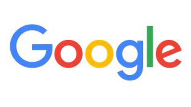 Credit: Google(MOUNTAIN VIEW, Cali.) — A new era calls for a new logo.
As Google restructures under a new holding company called Alphabet, the search giant announced Tuesday its logo is getting a slight makeover — beginning with a new typeface called “Product Sans” which is designed to look like the fonts seen in school books.
“The Google logo has always had a simple, friendly, and approachable style. We wanted to retain these qualities by combining the mathematical purity of geometric forms with the childlike simplicity of schoolbook letter printing,” Google’s design team wrote in a blog today explaining the rationale behind the changes.
While the new design includes the same blue, red, yellow and green letters that have been used throughout Google’s history, the shades have been slightly tweaked and the e at the end of Google remains tilted — a nod to the company’s sometimes unconventional ideas.
This marks the sixth time Google has changed its logo in the company’s 17-year history.
Copyright © 2015, ABC Radio. All rights reserved.